
Why do we love TV shows? Yes, we love the characters. Of course, we love the stories. But let’s be honest, sometimes it’s not the people who stay with us. It’s the door with the perfect shade of purple, the stones of an old street, or that cozy café corner where everything seemed to happen.
That’s where art direction comes in. Because art direction isn’t just about set dressing, it’s the memory of the story itself.
Remember how Sex and the City turned New York into a “map of freedom”? Or how Game of Thrones transformed Dubrovnik’s walls into Westeros, drawing millions of tourists?
When a show ends, we may forget the characters, but the places stay with us. Because a location doesn’t just carry the story, it imprints itself on our memory and often becomes tourism. Production designers, in a way, don’t just build sets; they reshape cities’ destinies.
GAME OF THRONES – DUBROVNIK’S MEDIEVAL WALLS ART DIRECTORS: GEMMA JACKSON & DEBORAH RILEY
What makes a fantasy world believable is often how convincingly it connects with real places. Game of Thrones did this brilliantly, Dubrovnik’s stone walls and narrow streets became King’s Landing with almost no change.
The art direction made two key choices:
Keeping the real location authentic: Dubrovnik already looked like a medieval city. Its stone textures and narrow alleys were left as they were, with only small additions (flags, statues, temporary gates) to build the world of Westeros.
Blending digital effects with real textures: CGI towers and palaces were integrated using lighting and colors that matched the natural tone of the stone. The question “is this real or CGI?” simply disappeared.
Sociologically, Dubrovnik’s transformation was also striking. The city became more than a tourist destination, it turned into a “fantasy capital” in the global imagination. Viewers didn’t just watch the story; they adopted the city itself. After the show, fans didn’t just want to visit Dubrovnik, they wanted to walk through King’s Landing.
Emotionally, Dubrovnik gave people a sense of “touchable fantasy.” Usually, fantasy worlds exist only on screens or in the imagination, but here, you could actually walk through them. That made the memory of the place incredibly powerful.
And the tourism effect was immediate: Game of Thrones tours, themed shops, booming local businesses. Dubrovnik became not just a city, but a living stage set.
In short, Game of Thrones didn’t just use Dubrovnik as a backdrop, it made it one of its leading characters. The art direction turned a real city into a lasting piece of collective fantasy.

EMILY IN PARIS – WHEN CLICHÉ BECOMES A DREAM ART DIRECTOR: ANNE SEIBEL
Paris has always been one of the world’s most visited cities. But Emily in Paris took its romantic image and turned it into a living postcard. The art direction leaned into every cliché, and did it intentionally.
The art direction made three key choices:
Constant repetition of iconic locations: The Eiffel Tower, the Seine, cobblestone streets, cozy cafés, each episode featured them to remind Paris’s romantic identity.
A vibrant, exaggerated palette: From Emily’s apartment to her office, every space glowed with flowers, bold colors, and patterns, making Paris look even more glowy and magical.
Blending fashion and city: Paris was presented not just as a city but almost as a runway. Costumes and locations worked together to brand Paris as the home of style and love.
Sociologically, the show turned Paris into a global brand. Everyday realities (traffic, crowds, immigrant districts) were hidden. Instead, viewers –especially foreign viewers- were given a “fantasy Paris” that matched and amplified their ideal version.

Emotionally, Emily in Paris sparked the dream of actually living there. The Paris it showed wasn’t a real city but a spotless romantic stage, and fans wanted to experience it that way. Tourism followed immediately; cafés, bridges, office building and even Emily’s apartment from the show became must-see stops.
In short, Emily in Paris didn’t reinvent Paris, it deliberately polished and exaggerated the city’s existing clichés, presenting them to the audience as a glossy dream. Through art direction, it erased the city’s real-life chaos and built a “sparkling fantasy version” of Paris instead. Viewers embraced this imagined Paris, embedding it in their memories and claiming it as their own, both emotionally and as a tourist destination.
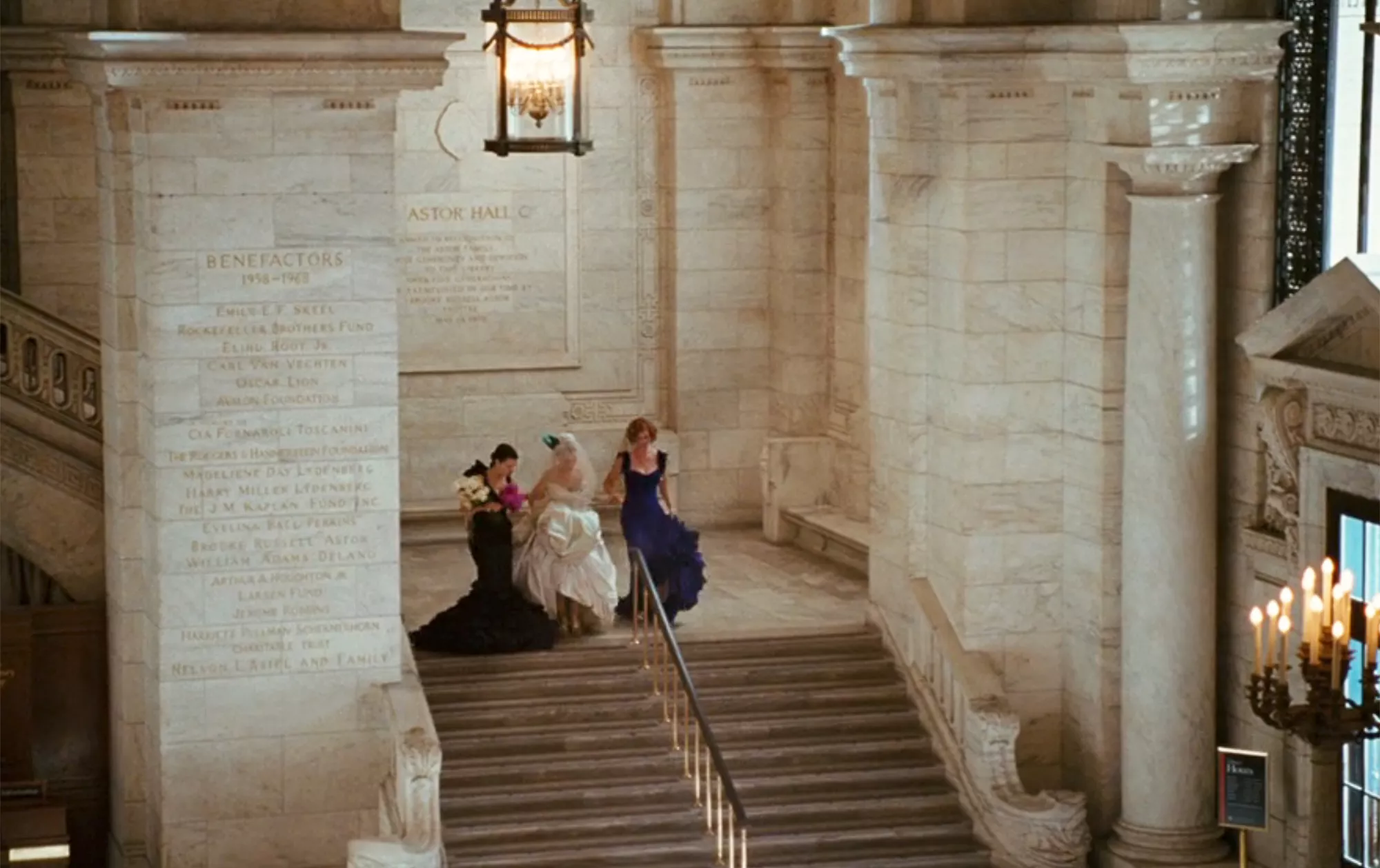
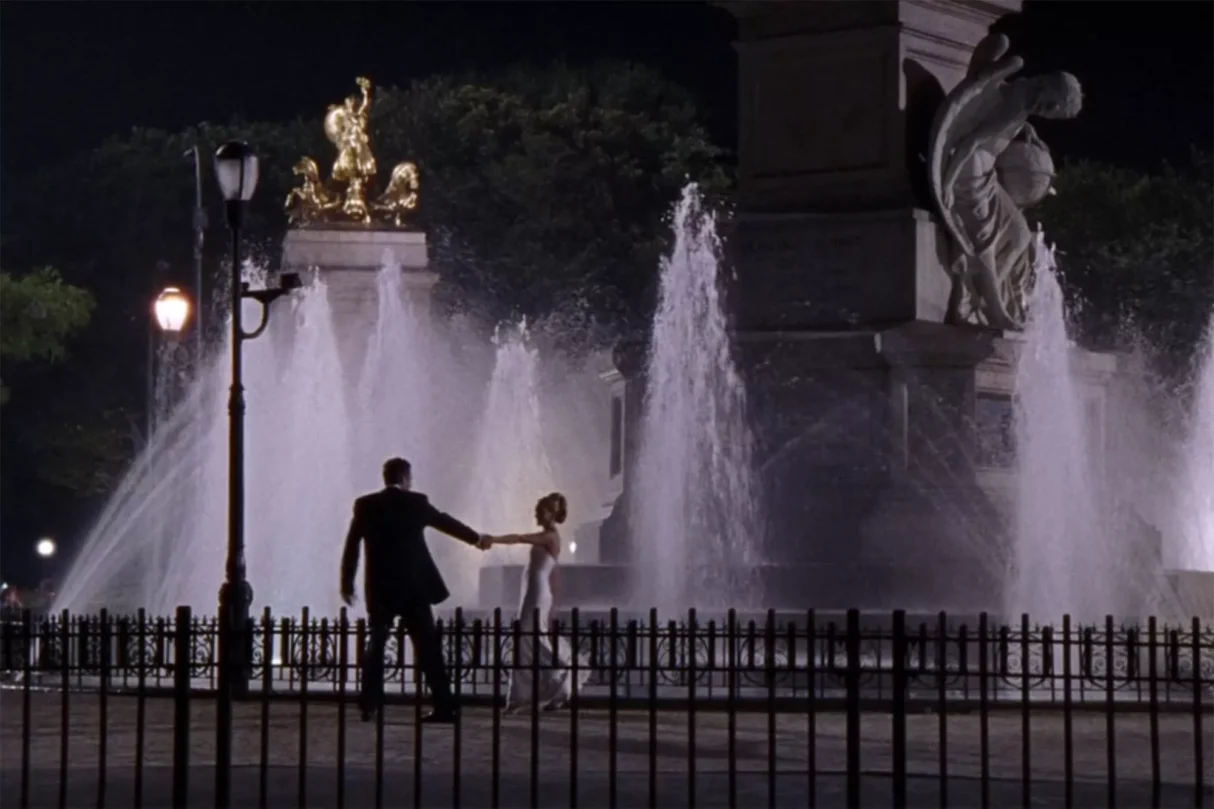
SEX AND THE CITY – THE STREETS OF NEW YORK ART DIRECTOR: JEREMY CONWAY
New York has served as a backdrop for countless films and series, but Sex and the City did something different, it turned the city into a character of its own, the show’s “fifth lead.” Just as much as Carrie, Miranda, Charlotte, and Samantha, New York’s streets, cafés, boutiques, and parks became part of the audience’s memory.
The art direction made three key choices:
Making iconic places feel everyday: Central Park, Broadway lights, SoHo streets, small cafés, the city’s famous images were woven naturally into the characters’ daily routines. New York became not a distant postcard view but a “lived-in space of experience.”
Creating an identity through apartments: Carrie’s small yet distinctive apartment and Miranda’s minimal home were designed to reflect their personalities. Viewers could read each woman’s character through her space.
Blending fashion with the city: Just as Emily in Paris turned its city into a runway, Sex and the City transformed New York into a stage for style. Costumes didn’t just define characters; they also helped stylize the city itself.
Sociologically, the series made women’s independence visible through the city of New York. Restaurants, offices, bars, and boutiques together formed a network that made the presence of self-sufficient working women appear “normal” and “natural.” As viewers watched love, friendship, and career struggles unfold in these places, they also witnessed a social shift taking shape.
Emotionally, New York became a place of independence and experience in the audience’s memory. Conversations in Central Park or breakups on apartment staircases made the city not just a backdrop but a vessel of emotion and remembrance.
And then came tourism. Fans wanted to see Carrie’s apartment, Magnolia Bakery, the restaurants and bars they’d memorized from the show. They didn’t just want to visit New York, they wanted Sex and the City’s New York.
In short, Sex and the City didn’t reinvent New York, but it blended it with a new identity, modern, free, and full of experience. Through art direction, the city stopped being a set and became a living character, one that viewers connected with and embraced as their own.
FRIENDS – THE ICONIC PURPLE DOOR AND CENTRAL PERK ART DIRECTOR: JOHN SHAFFNER
Friends wasn’t just a story of six friends, it was also a sitcom where the settings themselves became characters. Monica’s apartment and the Central Perk café left a lasting mark on the collective memory of 1990s youth. For viewers, these spaces became symbols of friendship, belonging and youth.
The art direction made three key choices:
Turning the apartment into a stage: Monica’s home, with its open layout gave the audience a theatrical sense of openness. The colorful decor, the iconic purple door, and the cozy clutter made the apartment both intimate and unforgettable.
Turning Central Perk into a second home: The café served as the group’s regular meeting point. The iconic orange couch, posters on the walls, and soft lighting turned it into a comfortable and safe zone of belonging.
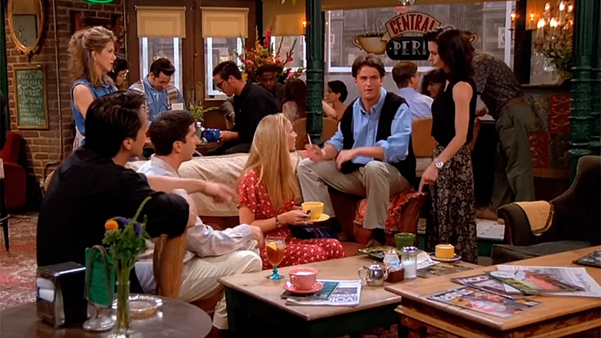
Aligning the color palette with emotions: Warm pastel tones created a cozy atmosphere, while small details (like Joey’s recliner or Monica’s kitchen) gave each space its own personality.
Sociologically, Friends portrayed 1990s urban youth culture through New York apartments. The idea of a “chosen family”, friends who form a home outside of traditional family structures, became visible through these spaces. Apartments and cafés embodied a new kind of city life and independence.
Emotionally, every viewer wanted to walk through that purple door or sit on that orange couch. These spaces turned into symbols of friendship and shared memories.
The tourism impact was also remarkable. Even years after the series concluded, the Central Perk set at Warner Bros. Studios became a permanent fan attraction. Monica’s purple-doored apartment was reconstructed for fans, and Central Perk-themed cafés opened around the world. The setting evolved into not just a part of the show but a global cultural icon.
Friends turned an ordinary apartment and a small café into universal spaces of collective memory. Through art direction, authenticity and theatricality were blended seamlessly, making the locations unforgettable. Viewers continue to keep them alive, not just on screen, but in their memories and even on their bucket lists.
Written by RU!, this article was featured in Episode Magazine’s ATF 2025 issue.